Opeqo Parrot Community
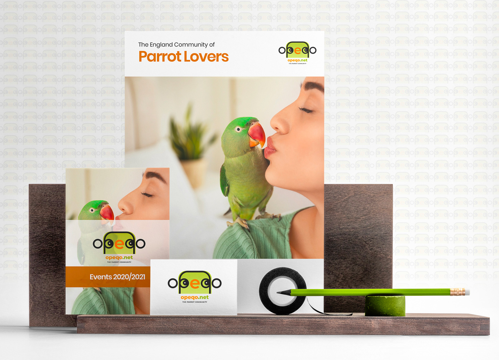
Opeqo is a community of parrots lover based on Durham, England. They asked me a for a colorful logo, inspired to the animal they love. I played with the letters to create the shape of a parrot: letters “p” and “q” are the eyes, letter “e” in the middle is the beak. I used a green gradient, the color of the community founder’s parrot. Her name is Betty and she is very funny.
Typography and colors

I really love our logo and how Sara played with the letters to “hide” a parrot inside the text. Nobody notice the text at first and then, but when they get it the comment every time is “wow, it’s just genial”! I printed it in some shirts and looks great. Thanks Sara.

